

Matt Wolfinger
Data courtesy of Nolan Conaway on Kaggle
Introducing the Data
In this report, data from Nolan Conaway on Kaggle entitled "18,393 Pitchfork Reviews" are used to analyze and examine the many nuances present in reviewing an album of music for an online publication. The data catalogues over 18,000 music reviews from music-centric online publication Pitchfork. Conaway scraped these reviews through Python. The scrape pulled data of Pitchfork reviews for the timeframe January 5, 1999 through January 8, 2017, leaving us with nearly two decades of data to work with. The original was in an sqlite file format, which I eventually managed to convert into a .csv file through the use of the DB Browser for SQLite application. I imported those files into Google Sheets and manually compiled them into one unified table, which became "pitchfork." From there, I saved it as a .csv file and imported it into RStudio as "pitchfork.rev."
A tedious process to be sure, but one that I was determined to take on due to my personal love for music and the value I saw in the potential of the data set in addition to the sequential analysis. In the data set, each row corresponds to a single album of music. For each album, we examine the following variables:
- title: the title of the review.
- artist: the artist who produced the album.
- genre: the genre of music the album falls under, dictated by Pitchfork themselves.
- score: the final precise scoring given to the album (0.0 - 10.0).
- best_new_music: noted in binary code, with 0 indicating no "Best New Music" label included and 1 indicating a "Best New Music" label inclusion.
- author: the person who wrote the piece.
- year: the year of the reviewed album's release.
For the sake of transparency, note that a single column entitled "url" was removed from the raw data set for the sake of this analysis, as the urls of the articles do not pertain to the analysis at hand. Columns also present in the data set concerning variables such as the date of publication, the label the album was released under and a few other scattered factors were ommitted to streamline the process. Another column entitled "content" was removed from the raw data set, which contained the actual text of the reviews. In a smaller set of data, the content of the articles would have been interesting to evaluate. For the sake of not bricking my laptop and considerably increasing load times, I decided to opt out of including it this time. That, and Google Sheets couldn't handle importing it for compiling into one .csv file. So actually — I blame Google.
If you're interested in seeing all of the ommitted columns, check out the data yourself through Kaggle.
Additionally, rows 18395 - 22680 were omitted. The data contained in these rows are unclear and incomplete. According to Conaway, he catalogued "18,393" reviews. As such, the data that are analyzed should only pertain to all rows up until 18,394 (with the header of each column acting as the first row).
Analyzing the data
We can now perform some basic analysis on the data loaded. The sections that follow explain that analysis.
Number of reviews per genre
With over 18,000 reviews in the data set, one of the first questions I had concerned the breakdown of the genre. I ran some functions in R to group the data by genre and summarize the number of their appearances in the data set.
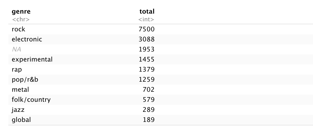
Rock landed at number one with 7500 occurrences, over double the reviews as the second place condenter, electronic with 3008. Global sat at the bottom with 189 total reviews. The third most popular genre is actually the absence of genre. Sure, it could have something to do with the reviewer wanting to say it transcends whatever genre exists, but I personally think it may pertain to the semi-restricting amount of nine total genres that it seems nearly 2000 albums didn't fit into. We'll take care of those a bit later.
Average score per genre
So here's where the latter part of this analysis comes in. The second observation I want to include in this data visualization concerns the average score of each genre. I grouped them by genre in R and got the mean of the score variable.
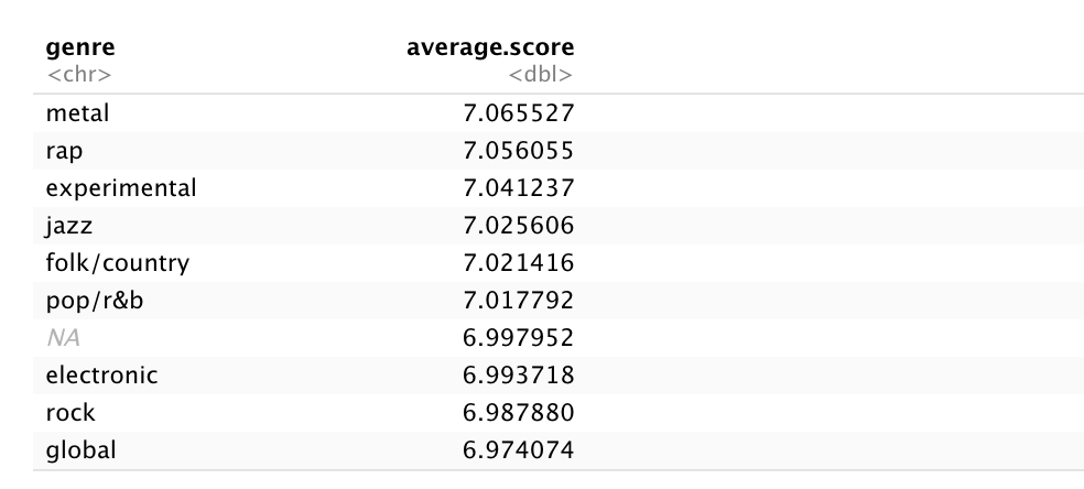
Metal came out with the highest rating at 7.06, with rap and experimental close behind. But wait, you may be asking, wouldn't rock be subject to a much lower score as a result of having the most reviews by a long-shot? I'm so glad you asked! That's exactly what I'm going to compare.
Visualizing the data
For the rest of our time spent together, we'll be exploring the previous observations through the creation of in-depth data visualization to tell stories with the information we've obtained.
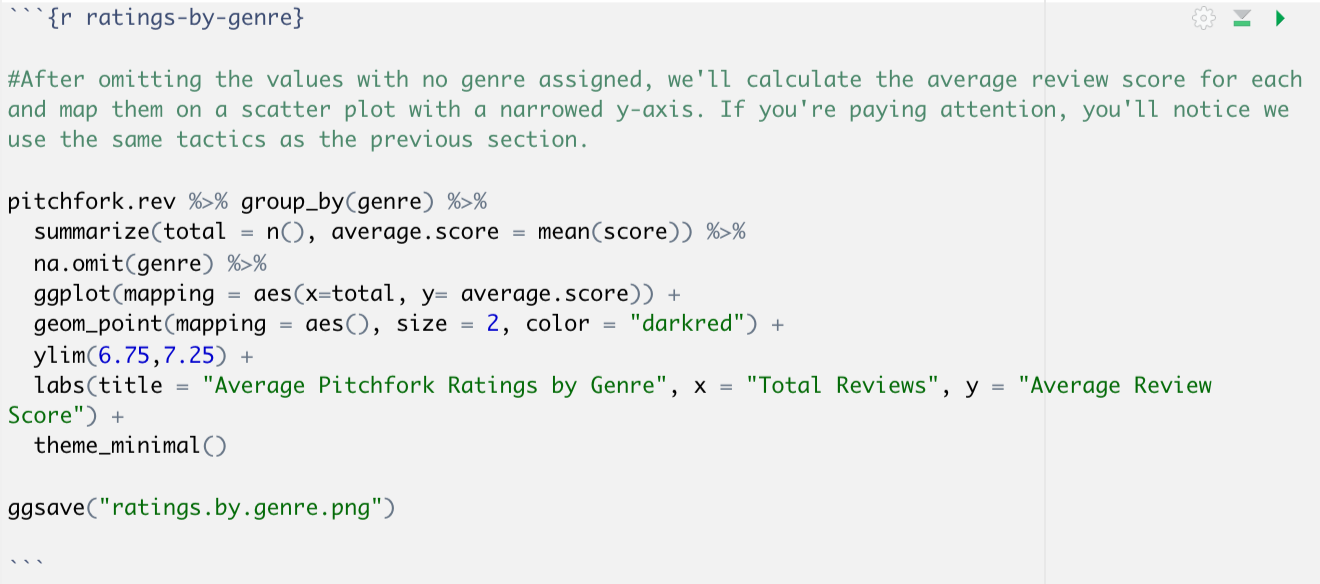
Ratings by genre
Right now, we're going to create a data visualization that compares the genre of review to its average score (y-axis) using the context of the number of reviews (x-axis) to see if there's a correlation. After omitting the values with no genre assigned, I calculated the average review score for each and mapped them on a scatter plot with a narrowed y-axis. If you're paying attention, you'll notice we used the same tactics as the previous sections.
Here's the result:
The narrowing of the y-axis turned out pretty well visually — it gives the data room to breathe while still emphasizing how close the scores are in their averages. After I built that in R, I hopped onto Illustrator and slapped some labels on that bad boy because I, for one, value my hair and would rather not see it pulled out. As it turns out, there really isn't much of a difference in the average review score per genre, despite some being far more prevalent in Pitchfork's catalogue. That's a testament to the impartial nature of their most prominent critics. Just as I thought, metal — the genre with the highest average — is one of the newer ones. I'm sure that'll level out with time, as is the case with rock and electronic.
Timeline of Critic and Average Review Score
Next thing I'm looking at concerns a theory that I wanted to evaluate concerning the amount of articles a critic has written and their overall average scores over time.
Do critics that have been writing for Pitchfork longer become more cynical with their scores?
I created a data set that stored the number of times each critic appeared, and filtered those critics so only those who have written consistently are shown, to simplify the data. I opted to only show the critics who have written at least 25 reviews. The data was then grouped by author and the average score mapped to the y-axis, assigning the number of total reviews per critic to the x-axis in the geom_point function in ggplot (adding geom_smooth to create a line of best fit).
This visualization was the result:
Peeking into the data set in R, I found a few outlier critics that I chose to label on the graph itself. Below, you'll find their number of reviews, average score and a link to their reviews:
Scores vs Best New Music
The "Best New Music" title is put very rarely by Pitchfork critics on an album review. It's the website's equivalent of getting a gold star or added to a favorites list. There's no real answer as to what classifies something as good enough to receive the title, but I have a working theory that there may be some sort of correlation between the scores that critics give to the albums and the prevalence of "Best New Music" ratings. It may be possible that the distribution of the "Best New Music" label becomes more common with higher scores. Since this practice began in 2003, we'll be sorting the data accordingly.
A histogram is going to be our best bet to display this data. The visualization will utilize two separate histograms, each with their own layers, to illustrate the distribution. Let's go a step further and shift the transparency using "alpha."
This took a while, but I'd argue the result was more than worth it:
As you can clearly see illustrated in that visualization, there does appear to be some sort of correlation between the prevalence of distribution for the "Best New Music" tag and an increase in the album's received score. I'm hesitant to declare any sort of causation between the two because, well, that's a day one data mistake.
What's Next
Moving forward, it'd be interesting to see what that tiny speck of perfect 10s without "Best New Music" labels are (I'm guessing they may have something to do with retrospective reviews of posthumous artists).
I'd also want to take a closer look at those outlier critics. Jenn Pelly in particular would be interesting, as she seems to still consistently give albums positive scores and loves to dish out that "Best New Music" label. Coincidentally, she was the one who gave a perfect 10 to Fiona Apple's album Fetch the Bolt Cutters last year — the publication's first perfect score in over a decade.
As a majority of the analysis concerning scoring has been completed regarding what I'm interested in, it may be worthwhile to analyze the textual contents of the articles that were omitted from the original data set's "content" variable.